Visual
Analytics and Imaging Laboratory (VAI Lab) Computer Science Department, Stony Brook University, NY |
Visual
Analytics and Imaging Laboratory (VAI Lab) Computer Science Department, Stony Brook University, NY |
Abstract: An exemplar is an entity that represents a desirable instance in a multi-attribute configuration space. It offers certain strengths in some of its attributes without unduly compromising the strengths in other attributes. Exemplars are frequently sought after in real life applications, such as systems engineering, investment banking, drug advisory, product marketing and many others. We study a specific method for the visualization of multi-attribute configuration spaces, the Data Context Map (DCM), for its capacity in enabling users to identify proper exemplars. The DCM produces a 2D embedding where users can view the data objects in the context of the data attributes. We ask whether certain graphical enhancements can aid users to gain a better understanding of the attribute-wise tradeoffs and so select better exemplar sets. We conducted several user studies for three different graphical designs, namely iso-contour, value-shaded topographic rendering and terrain topographic rendering, and compare these with a baseline DCM display. As a benchmark we use an exemplar set generated via Pareto optimization which has similar goals but unlike humans can operate in the native high-dimensional data space. Our study finds that the two topographic maps are statistically superior to both the iso-contour and the DCM baseline display.
Teaser: The below shows the user interface components, shown here is the Pokemon dataset:
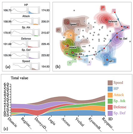
The GUI elements are: (a) Scented slider widgets, one for each of the 6 userchosen attributes, (b) shaded topographic map of these 6 attributes with the 8 user-marked exemplars auto-connected by a path, and (c) stacked area chart with the 6 attributes and the 8 exemplars. It can be observed that each exemplar has a unique attribute configuration.
The four designs we studied: This figure shows the 4 designs we created and studied, alomng with the auto-generated Pareto paths for 7 attributes each:
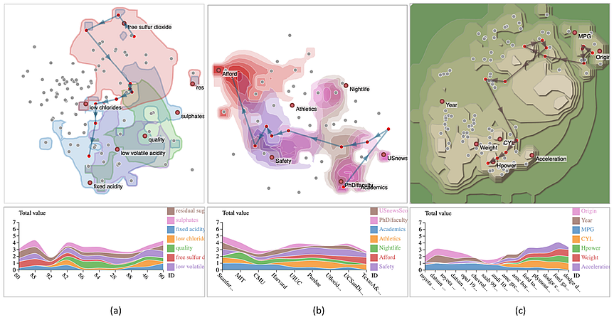
We see here: (a) The wine dataset visualized with the single iso-contour enhancement, (b) the university dataset visualized with the value-shaded topographic rendering, and (c) the car dataset with the topographic terrain rendering.
Paper: X. Cheng, S. Cheng, K. Mueller, "Graphical Enhancements for Effective Exemplar Identification in Contextual Data Visualizations," IEEE Trans. on Visualization and Computer Graphics, 29(9):3775 - 3787, 2023 PDF