![]()
K E R M I T L O G O S K
E T C H E S
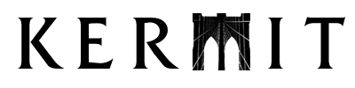
The purpose of this page is to present some image treatments and type style ideas for consideration. The client's concept is to use images of New York thematically for the design of the interface. Using a bridge as a metaphor for communications software was also discussed.
|
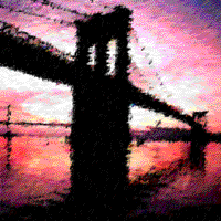
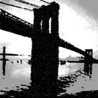
The Brooklyn Bridge. These renderings could work as splash screen
backgrounds, or as art for the packaging, user manual, or install
wizard. |
|
|
|
|
|
|
|
|
I thought I'd try a couple of views at the 32 X 32 program icon size. I think both designs held up pretty well so far. |
|
|
I think this design is elegant, and I like the way the bridge's cables suggest a network or the Web. |
|
|
|
|
|
Serif Gothic Black. It feels stylish but the lower case makes the logo more user-friendly. |
|
|
|
|
|
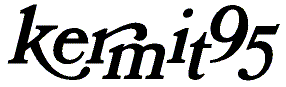
Bookman Bold Italic. This is a very "New York" typeface (New York magazine). I got a little playful with it but I like its energy. |
|
|
|
|
|
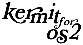
Something I thought looked like high-tech communications software. |
|
|
|
|
|
Futura Black. This typeface has a 50's feel to it. It also has an "industrial strength" look. |
|
|
|
|
|
A "circuit city" type of look.The typeface is called "Dynamo". |
|