TEXT & GRAPHICS
Origins
Letterforms
Properties of Letterforms
Typographic Measurements
Typesetting
Typography and Fonts
TrueType and PostScript Type 1
ASCII
Unicode
Text on the Web
Origins
Written language has evolved from pictorial representations of objects and
events into sophisticated systems of symbols representing spoken sounds. The
process had three stages:
Pictograms
Pictograms are drawings of fundamental objects and ideas such as man, woman,
spear, tree, and shelter. These were simple and literal representations, and
they were combined to form a visual storyboard. There was no connection between
the spoken word and the object pictured; a pictogram represented a mental
image of an object, not its name.
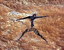
Cave painting from eastern Algeria.
Ideograms
Ideograms are simplified pictures selected by custom to become fixed pictorial
symbols of an object or concept. For example, a number of "tree" symbols are
unified to make a "forest," or the symbol for man, woman, and child are consolidated
into a single "family" symbol. As such the picture became more abstract. The
name of the object (or its action) is closely identified with the picture.
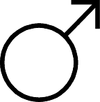
Male symbol (shield + spear).
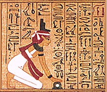
Phonograms
Phonograms are syllabic signs and symbols representing primary oral sounds.
As time passed, they they diminished in resemblance to their original forms,
but the letters in modern alphabets are the simplified renderings of their
pictorial beginnings.
 |
|
| Egyptian hieroglyphic. |
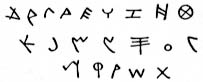
Phoenician alphabet. |
 |
|
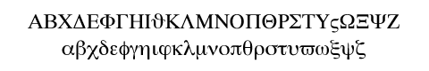
The modern Greek alphabet.
Derived of Phoenician and Semitic languages, ancient Greek added the
five vowel sounds (a,e,i,o,u) making it a truly phonetic language. By
600 BC it was written from left to right. The word "alphabet"
comes from a concatenation of the first two Greek letters, alpha - beta.
|
top of page
Letterforms
Although the basic letterforms of the modern Western alphabet have changed
little since the days of ancient Rome, the appearance of written and printed
letters evolved over time. These variations in style are due largely to changes
in the tools used for writing and printing.
- stone-carved letters of ancient Roman monuments
- hand-drawn illuminated manuscripts of gothic monks
- hand-cut wooden type used in early printing
- acid-etched metal type
- photo lithography
- typefaces designed for modern digital output
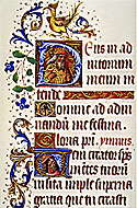 |
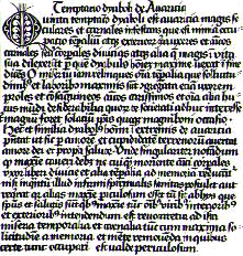 |
| Illuminated manuscript. |
Woodblock print, 1466. |
|
|
|
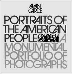
Avant Garde magazine cover, by Herb Lubalin.
|
|
|
top of page
Properties of Letterforms
I. Serif and Sans Serif
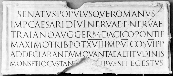
The type design that was used by the Romans is named Capitalis Quadrata. Capitalis
Quadrata was successively developed by the Romans from the original Greek alphabet,
and was introduced around 200 BC.
 |
 |
|
|
| Inscription from Trajan's column in Rome. |
Roman capital.
|
Serif letterforms relate aesthetically to the architecture of the buildings
or monuments they adorned. They are considered classical.
capital, in architecture
in architecture, the crowning member of a column, pilaster, or pier. It acts
as the bearing member beneath the lintel or arch supported by the shaft and
has a spreading contour appropriate to its function.
— The Columbia Encyclopedia, Sixth Edition. 2001.
Sans Serif literally means "without serif". These letterforms emerged
in the latter half of the nineteenth century, and also reflect the architectural
style of their time.
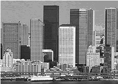 |
|
| Skyline. |
Capital "I" in Arial Black typeface.
|
II. Case
The Roman alphabet only had capitals. The lower case letters, or Caroline miniscules,
are the result of Charlemagne (leader of the Holy Roman Empire, 800 - 814 AD)
and his efforts to create a consistent, more economical writing style. These
were the prototype for our modern small letters.
The names for these letters originated from where they were housed in the typeshop.
Capitals were stored in the upper section of a typecase, while small letters
were kept in the lower section. When setting type, a printer would take the
metal type from either the upper or the lower case.
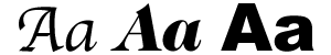
III. Italic
The drawing of letterforms with a consistent, pleasing slant to the right is
called "italic", referencing the style of Italian calligraphers.
Italics are often used to add emphasis to a line of text.
IV. Stroke weight
Calligraphers used a reed pen held at a constant "cant", or angle,
to render type. This produced thick and thin strokes for each letterform. Serif
letterforms typically have varying stroke widths. Sans Serif letterforms, however,
usually have consistent stroke weight. Letterforms with heavy strokes are called
"bold".
BOLD CAPITAL LETTERS GET ATTENTION.
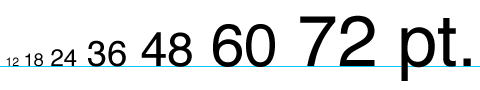
Typographic Measurements
Point size
In the western world there are two traditional systems in use for specification
of typographical measures. Both systems use the notation of a graphical point
as their smallest unit of absolute length, but those two points are not equal
in size.
On the European continent the Didot system is the one most widely in use. The
basic point unit in this system is defined as 0.376 millimeters (1/68 inch).
In the United Kingdom and in America another variant of a point based measurement
system is prevalent, the Anglo Saxon system. Today the basic point of the Anglo
Saxon system is defined as 1/72 of an inch.
In the US, a pica is a printer's measure, approximately refering to the height
of a line of text, and there are 12 points to a pica. There are 6 picas to an
inch. A point is approximately equivalent to one pixel on a 72 DPI monitor.
The em and en
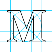
The origin of a square as a relative unit of length for layout of characters
dates back to the Roman Empire. The most characteristic part of Capitalis Quadrata
is that all of its letters are designed within a specific relationship to a
square drawn from the height of the type.
Not all letters in the Roman alphabet filled the full width of the square,
but the letter "M" did. Thus the font height is defined by a universal
unit of length by the name of one "em". That 1:1 relationship between the width
of the letter "M" and the width of an "em" has been modified
over time. The invention of lower case letters introduced descenders, and after
1000 AD diacritical marks make their appearance, adding even more to the height
of a type. The size of the square, and hence the em, increased to cover both
descenders and diacritical marks.
Ü Ñ Á
Traditionally the em has been used to create white space areas in typeset text.
It's the standard measurement for text indents, together with another block
of white space that is exactly half as wide, the half square. The width of the
half square has also been given a name of its own as one "en".
dash -
em dash —
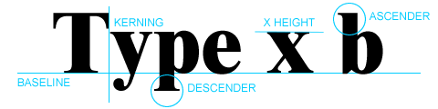
The x height
The x height is another relative length unit that is derived from the height
of a font's lower case letters that do not have descenders (i.e. the height
of the letter "x").
Line spacing, or leading
The line height is defined as the distance between the baselines of two consecutive
lines of text. Introduction of extra white space between lines of text was traditionally
done through a process called leading. The typesetter inserted thin strips of
brass with a known thickness between lines of type blocks in the printing frame
to increase the distance between the baselines of his types.
Kerning
Kerning is the space between letters, which can be increased (> 100%) or
reduced (< 100%). Certain character pairs, like the capital "T"
and the lower case "o" will appear to have too much white space between
them when set normally. Kerning tables embedded in modern digital fonts make
allowances for these pairs automatically.
top of page
Typesetting
|
|
|
|
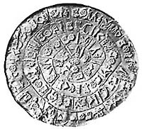
Phaistos Disc, a terra-cotta disc found in Crete
with 31 groups of characters, 1700 BC.
|
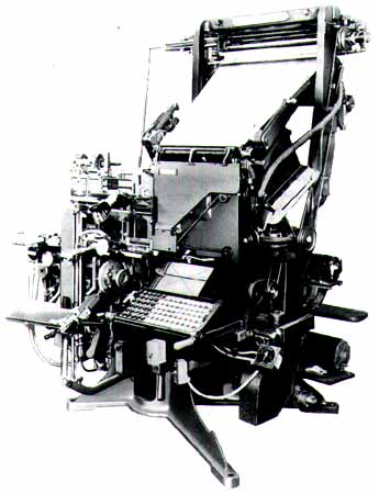
Linotype machine.
|
From the middle of the fifteenth century to the middle of the twentieth, most
printing used a technique where each letter is carved in wood and then cast
in lead. These letters were placed, or set, in a printing press, where they
were inked and printed onto paper.
Typesetting became automated in the late 1800s as a result of the invention
of the Linotype and Monotype machines. Operators of these machines used a keyboard
to set type, which was then cast in hot metal for use in a printing press.
Phototypesetting, introduced in the 1950s, did away with metal type completely.
Photoype systems produce film negatives or digitized images, which are then
printed using offset lithography.
Modern digital typesetting systems encode typographic characters, defining
each letter by the position of points on a grid. The quality of the output depends
on the number of dots per inch (DPI) the output device is capable of producing.
The growing accessibility and pervasiveness of digital devices such as computers,
PDAs, cell phones, and digital projectors have given rise to many "on-screen
only" applications for type. Because these letterforms are created through the
combination of pixels, the quality and legibility of the type these devices
can display is limited by the screen resolution (measured in pixels) each is
capable of.
The illusion of smoothness of on-screen type is created through anti-aliasing.
However, this technique causes elements of letterforms, such as the thick and
thin strokes of serif typefaces, to lose legibility, especially at lower screen
resolutions. This has led to the design of typefaces, so-called "pixel fonts",
specifically for digital display that are legible at smaller sizes because they
do not require smoothing.
top of page
Typography and Fonts
The word "font" refers to a foundry where metal type was cast. It
describes all the variations of a type design. Font is synonymous with "typeface".
Below are some general categories of fonts:
 |
 |
|
Monospace fonts, such as Courier, are derived from typewriter
fonts, where letter widths had to be uniform. They are used sometimes
to distinguish computer code from body text.
|
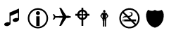
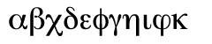
Symbol fonts are used in cartography, architectural
renderings, and musical notation. |
 |
 |
|
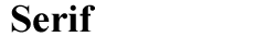
Serif fonts, like Times Roman, are more traditional designs and
are considered the most legible. They are often used to set body copy
in print. On computer screens, however, at small point sizes, their detail
is lost due to antialiasing.
|
Screen fonts are designed primarily for use on mobile
computing devices like PDA's, and are not meant for printing. |
 |
 |
|
Sans Serif fonts, like Helvetica, are modern looking. Typically
the strokes have consistent weight.
|
Display fonts, like Glaser Stencil, are designed for
use in headlines, not for body copy. Many do not have a lower case. |
 |
 |
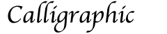
| Calligraphic fonts have strokes that vary in thickness,
and the letterforms are slanted, like italic versions of other fonts. |
Language fonts often require unique keyboard mappings. |
For a more detailed classification, see the Adobe
Type Library font classification web page
Each typeface can have many variations including bold, italic, and condensed
versions. A table of all the characters in a font (upper and lower case, numerals,
punctuation, and special characters) is called a type specimen.
Typographic design has always been the most skilled of the graphic arts, from
the days when typographers had to etch metal plates with their designs, to today
when they have to program the outlines of a digital font. Thus many fonts are
named after their designers, such as Caslon, Baskerville, Bodoni, Goudy, or
Lubalin.
top of page
TrueType and PostScript Type 1
TrueType (TT) and PostScript Type 1 (PS1) are both multi-platform outline font
standards for which the technical specifications are openly available. "Multi-platform"
means that both font types are usable on multiple sorts of computer systems.
"Outline font" means that they describe letter shapes ("glyphs") by means of
points, which in turn define lines and curves.
This representation is resolution independent, meaning that outlines, by their
very nature, can be scaled to pretty much any arbitrary size. But an outline
font must be represented by the dots of the output device. The process of converting
the outline to a pattern of dots on the grid of the device is called "rasterization."
When there aren't enough dots making up the glyph (such as at small sizes or
low resolutions), there can be inconsistencies in the representation of certain
letter features, at a single size, due to different rounding based on how the
outline happens to sit on the grid. A common form of this is that the widths
of the letter stems can vary when they shouldn't. Worse, key features of the
glyphs can disappear at small sizes.
However, PostScript Type 1 and TrueType fonts both have a means of dealing
with these inconsistencies, called "hinting." This consists of additional information
encoded in the font to help prevent these problems by using interpolated values.
top of page
Character Mappings
ASCII
The American Standard Code for Information Interchange is a standard seven-bit
code that was proposed by ANSI (American National Standards Institutue) in 1963,
and finalized in 1968. ASCII was established to achieve compatibility between
various types of data processing equipment.
ASCII is the common code for microcomputer equipment. The standard ASCII character
set consists of 128 decimal numbers ranging from zero through 127 assigned to
letters, numbers, punctuation marks, and the most common special characters.
The Extended ASCII Character Set also consists of 128 decimal numbers and ranges
from 128 through 255 representing additional special, mathematical, graphic,
and foreign characters.
top of page
Unicode
Fundamentally, computers just deal with numbers. They store letters and other
characters by assigning a number for each one. Before Unicode was invented,
there were hundreds of different encoding systems for assigning these numbers.
No single encoding could contain enough characters: for example, the European
Union alone requires several different encodings to cover all its languages.
Even for a single language like English no single encoding was adequate for
all the letters, punctuation, and technical symbols in common use.
These encoding systems also conflict with one another. That is, two encodings
can use the same number for two different characters, or use different numbers
for the same character. Any given computer (especially servers) needs to support
many different encodings; yet whenever data is passed between different encodings
or platforms, that data always runs the risk of corruption.
Unicode provides a unique number for every character, no matter what the platform,
no matter what the program, no matter what the language. Unicode is required
by modern standards such as XML, Java, and JavaScript.
Unicode enables a single software product or a single website to be targeted
across multiple platforms, languages and countries without re-engineering.
top of page
Text on the Web
The Internet is not "type-friendly":
- Fonts specified by the author of a web page may not be resident on the client's
computer, or the author's choice can be overridden by the user.
- There is no direct correlation between the HTML specification for type size
and point size. Different browsers show the same size type as larger or smaller.
- Special character support is limited.
- There is no support for kerning.
- Certain fonts may require alternate keyboard mappings.
- Font color varies cross-platform.
- Unlike print, computer displays are low resolution.
HTML has very limited text formatting options, such as:
HEADING 1
|
strikethrough
|
sample
|
HEADING 6
|
teletype
|
keyboard
|
|
SIZE 7
|
strong
|
citation
|
|
SIZE -7
|
code
|
definition
|
To work around these limitations web designers have a couple of options:
- Make a picture of the type with the desired design options and embed it
in the page (usually a .gif).
- Embed the font as an outline in an application (like Shockwave) that is
handled by a plug-in, not the browser.
CSS
A style sheet is a set of parameters for displaying text on a web page, which
is looked up by the requested document. The text on the page is formatted according
to the specs of the style sheet referenced by the page. The use of Cascading
Style Sheets (CSS) for formatting text on web pages brings many benefits to
authors:
- Authors can make a change in one location that reformats the entire web
site.
- Formatting options are extended through the use of style sheets.
- There is a consistent style applied throughout the site.
top of page
Icons
There are 3 general types of symbols:
 |
 |
 |
|
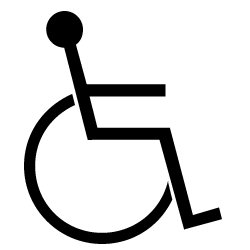
Literal
|
Abstract
|
Arbitrary
|
References
The Evolution of Type (http://www.mediumbold.com/)
Typographical Measurement Systems (http://css.nu/articles/)
Thomas Pinney, "True Type and PostScript Type 1: What's the difference?"
(http://www.truetype.demon.co.uk/articles/ttvst1.htm)
www.unicode.org