
Guidelines for Effective Use of Color
Properties of Visible Light
All light sources, except lasers, emit waves uniformly in all directions. The amplitude of these waves is percieved by the eye as brightness, or luminance. Light waves have extremely high frequencies. They are measured in nanometers (visible light ranges from 380 to 760 nanometers) or millimicrons or angstroms.
The wavelength of light determines its color, with red on the long end, and violet on the other. The range in between is the color spectrum. Pure spectral color can be seen in a rainbow or a prism. Most light sources emit a range of colors, and are called polychromatic. Some light sources, like neon, emit only a very narrow band of frequencies.
| Wavelength | Color |
|---|---|
| 400nm | Violet |
| Magenta | |
| Blue | |
| Cyan | |
| Green | |
| Yellow | |
| Orange | |
| 750nm | Red |
top of page
Color Perception
Human visible perception is based on the trichromatic theory of color. All
color can be blended using three primary colors. Presence of the three colors
at full strength produces white light, their complete absence produces black.
People perceive direct light in an additive color process, and reflected light
in a subtractive color process. The subtractive process means that different
surfaces absorb cetain wavelengths of light and reflect others. That is what
gives an object its color.
There are three ways we percieve color -
Frequency
Red = 700 nm
Green = 546 nm
Blue = 436 nm
Different colors evoke different reactions in viewers. Be aware that some of these reactions will be culturally specific. For example, in the U.S., brides often wear white as a symbol of purity and widows wear black as a symbol of mourning. However, in many Asian cultures, brides wear black.
Red is a color not commonly seen in nature, and when it is (fire, blood), it usually means danger
— warning, prohibition (stop sign), negative (a budget in the red), excitement, hotDark Blue is the color of the ocean
— stable, calming, trustworthy, masculine (often the color of police uniforms)Light Blue is the color of the sky
— cool, transparent (grid lines on grid paper)Green is the color of the landscape
— growth, positive, organic, go (traffic light), comfortingWhite is the color of a blank sheet of paper
— pure, clean, honestBlack is the color of night
— serious, heavy, deathGray is the color of fog
— neutral (icons for unavailable features in software are "grayed-out")Brown is the color of earth
— wholesome, unpretentious, dependable (United Parcel Service ad campaign)Yellow and Orange are the colors of sunshine
— active, positive (color schemes of fast food restaraunts)Purple is traditionally the color of royalty
Pink is the color of flesh
— feminine
In the example below, one color looks like two different colors:
 |
 |
In the next example, two different colors look similar:
 |
 |
Color Biology
The iris of the eye determines how much light strikes the retina. The retina
contains about 120 million rods and cones. Cones are sensitive to bright light,
and rods primarily are employed in night vision, and are less sensitve to color.
Chemical composition of the rods and cones is altered depending on the wavelength
(color) striking them. This chemical change is converted to voltages that send
the messages along the optic nerve to the brain for deciphering.
Physiological Principles
Color results from the interaction of light with the nervous system. There
are several components that affect color perception, including the eye lens,
the retina, and a color processing unit along the optic nerve.
Lens
The function of the lens is to focus the incoming light on the retina, which
contains the photo receptors. Different wavelengths of light have different
focal lengths so, for pure hues, the lens must change its shape so that the
light is focused correctly.
For a given lens curvature, longer wavelengths have a longer focal length, (i.e.,
red is the longest focal length and blue is the shortest). To have an image
focused on the retina the lens curvature must change with wavelength. This means
that if pure blue and pure red hues are intermixed, the lens is constantly changing
shape and the eye becomes tired.
A related effect is called chromostereopsis, which is that pure colors located at the same distance from the eye appear to be at different distances, e.g. reds appear closer and blues more distant.
The lens also absorbs light, it absorbs about twice as much in the blue region as in the red region. As we age the lens yellows, which means it absorbs more in the shorter wavelengths. So the result is that people are more sensitive to longer wavelengths (yellows and oranges) than they are to shorter wavelengths (cyan to blue) and this increases with age. The fluid between the lens and the retina also absorb light and this increases as we age, so older people become less sensitive to light in general, and especially the sensitivity to blue decreases.
Retina
The retina contains the photo receptors that absorb photons and transmit
chemical signals to the brain. There are two types: rods which are night-vision
receptors and have no color dependency, and cones, which have color sensitivity
and require a higher level of light intensity than the rods.
There are three types of photopigments in the cones; "blue" with a
maximum sensitivity at 430 nm, "green" with a maximum sensitivity
at 530 nm, and "red" at 560 nm (this wavelength actually corresponds
to yellow). The percentage of cones is not equal but is as follows: blue (4%),
green (32%), and red (64%). In addition, the cones are differentially distributed
in the retina. The center of the retina has a dense concentration of cones but
no rods while the periphery has many rods but few cones. The color distribution
is also asymmetrical. The center of the retina is primarily green cones, surrounded
by red-yellow cones, with the blue cones being mainly on the periphery. The
center of the retina has no blue cones.
We see objects by edge detection, where an edge can be created by a difference
in color or brightness or both. Edges formed by color differences alone, with
no brightness differences, appear fuzzy and unfocused.
Photoreceptors adjust their sensitivity to the overall light level, e.g. going
into or out of a dark room requires some adjustment time. There is also a required
minimum intensity level for the photoreceptors to respond. Blues and reds must
have a higher intensity than greens or yellows in order to be perceived.
Brain
From the retina the optic nerve (actually a collection of nerves) goes to the
brain but before it reaches the brain there is a color processing unit, called
the lateral geniculate body. This recombines the RGB color information into
three new channels as follows:
R-G gives red or green color perception
R+G gives the perception of brightness and also yields yellow (Y)
Y-B gives yellow or blue color perception
Thus, blue plays no part in brightness perception so that colors differing only
in amount of blue don't produce sharp edges. Also, note that since blue &
yellow and red & green are linked together it is impossible to experience
combinations such as reddish green or bluish yellow.
Color Blindness
About nine percent of the population has some kind of color perception problem. The most common is red-green deficiency, which can arise from a deficiency of either the red or the green photopigments. These people have difficulty distinguishing any color that is dependent upon the red:green ratio.
Click the link below to take a color blindness test:
http://www.toledo-bend.com/colorblind/Ishihara.html
Guidelines for the effective use of color:
Your eye and brain retain a visual impression for about 1/30th of a second. (The exact time depends on the brightness of the image.) This ability to retain an image is known as persistence of vision. Persistence of vision accounts for our failure to notice that a motion picture screen is dark about half the time, or that a television image is just one bright, fast, little dot sweeping across the screen. Motion pictures show one new frame every 1/24th of a second, and a computer monitor is scanned 30 times per second. The image of each frame is retained long enough to provide the illusion of continuous smooth motion.
Joseph Antoine Ferdinand Plateau was the first to recognize that the eye and brain required a resting time between images, and also realized that there existed an optimal number of frames per second to produce a moving image (he determined it was 16, which was the standard until the sound era of motion pictures).
 |
 |
Afterimage:
Prolonged stimulation by a bright object desensitizes part of the retina. This
area appears as a negative afterimage, a dark area or complimentary color that
matches the original shape. The afterimage may remain for 30 seconds or longer.
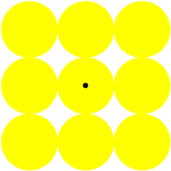
Stare at the black dot in the center of the image above. When the image changes, you should see a yellow afterimage in the negative (white) space.
Visual Memory
Visual memory is how many images can be remembered in a given time span, and how long those images are retained.
Click the links below to test your visual memory:
http://www.gluck.edu/learning-memory/mem_games/visualtest1.html
http://people.brandeis.edu/~sekuler/MemoryDemo/
Frequency and Pitch, Amplitude and Volume
| Decibels | Pressure | Typical Noise | Safety Level |
|---|---|---|---|
| 120 | 20Pa | Jet Aircraft Pneumatic Drill Threshold of Pain |
Probable Injury |
| 110 | Thunder |
Risk of injury | |
| 100 | 2Pa | Loud Rock Concert | Risk of injury |
| 90 | CO2 Pellet Gun 30cm |
Risk of injury | |
| 80 | 0.2Pa | Electric Typewriter Loud Music |
Safe |
| 70 | Noisy Restaurant or Office | Safe | |
| 60 | 0.02Pa | Normal Conversation | Safe |
| 50 | Quiet Office | Safe | |
| 40 | 0.2µPa | Suburban Street (No Traffic) | Safe |
| 30 | Quiet Conversation | Safe | |
| 20 | 2µPa | Watch Ticking Whisper |
Safe |
| 10 | Lowest Audible Sound | Safe | |
| 0 | 20µPa | Silence Threshold of Hearing |
Safe |
Click the link below to test your hearing:
http://www.freehearingtest.com/test.shtml
References
G. Scott Owen, Hypergraph (http://www.siggraph.org/education/materials/HyperGraph/hypergraph.htm)
"Physiological Principles for the Effective Use of Color", G. Murch, IEEE CG&A, Nov. 1984