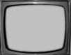
TV
4w X 3h
4w X 3h
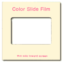
35mm slide
1.5w X 1h
1.5w X 1h
There is nothing worse than a sharp image of a fuzzy concept.
— Ansel Adams (1902 - 1984)In anything at all, perfection is finally attained not when there is no longer anything to add, but when there is no longer anything to take away.
— Antoine de Saint Exupery
Representing Reality
Reality is defined by time and space.
Space is represented by establishing a view. Everything within the boundary of the view is called a frame. (A frame is sometimes also called a viewport, window, canvas, support, ground, or stage).
Frames can in theory be any shape, and in painting or printing they can be sometimes elliptical or irregular. But in photography, video, and computer graphics frames are rectilinear. The main attribute of a frame is its aspect ratio - the relationship of width(w) to height(h). Video and computer displays are predominantly 4 units wide by 3 units high, while 35mm and 70mm film are 3 units wide by 2 units high. Another crucial aspect of a view is the viewer's position relative to the subject - the viewpoint. The viewpoint establishes horizon line, vanishing point, and perspective.
|
|
|
|
TV
4w X 3h |
35mm slide
1.5w X 1h |
Objects in space close to the viewer may overlap objects in the distance. Each object can be said to exist on its own layer, or picture plane. Objects on higher-ordered planes (foreground) obscure objects on lower-ordered layers (background). Size of these objects relative to each other is called their scale. Distance of an object from the viewer is indicated by overlap of other objects and also by scale. Objects that are closer appear larger than objects farther away, despite their actual relative sizes.
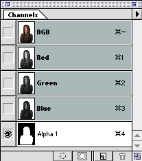
All the objects in the view share common attributes, such as color. Red, green, blue, and alpha is channel information which can be modified across layers. Color is also an indicator of the distance of an object from the viewer. Warmer colors appear to advance while cooler colors appear to recede. Also, in a landscape, the color of mountains (or other objects) in the distance shift towards blue due to reflected atmospheric color. Highly saturated colors advance and less saturated colors recede. Again, in a landscape, this is due to the effect of atmospheric conditions, such as haze, on objects in the distance. Contrast in hue, saturation, and brightness also indicates depth or the space between objects. The greater the contrast the greater the appearance of distance between objects, or depth.
Time is represented by establishing sequential views of a space, or successive frames. The frame rate is how many sequential frames are displayed in one second. Humans lose the ability to distinguish individual frames if they are displayed at a rate of 15 per second or higher. The frame rate for video is 30 frames-per-second (FPS) and the frame rate for motion pictures is 24 FPS. Web-based animations, such as Flash movies or animated GIF's, are typically in a range between 10 and 15 FPS.
Proportions of the Support
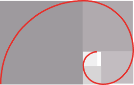
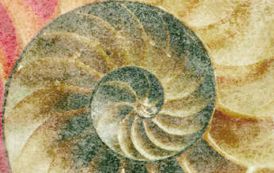
The Golden Mean, 1.61803398874989…, represented by the Greek letter phi, is a naturally occurring number, like pi, that repeatedly occurs in various relationships. Like pi, it is an irrational number. Unlike pi, it clearly and regularly appears in the growth patterns of many living things, like the spiral formed by a seashell or the curve of a fern. It is thought by artists from ancient times to the present to describe the most aesthetically pleasing rectangle.
 |
 |
Leonard of Pisa (1170-1250), better known as Fibonacci, introduced the Fibonacci
Series, a sequence of numbers; 0, 1, 1, 2, 3, 5, 8, 13, 21, 34, … in
which any number is the sum of the two preceding members. 0 + 1 = 1, 1 + 1 =
2, 1 + 2 = 3, 2 + 3 = 5, etc.
The Fibonacci Series and the Golden Mean are intimately connected. The Fibonacci
Series numbers increase at a rate equal to (actually, oscillating round) the
Golden mean. (The larger the numbers, the closer to the Golden Mean.) A rectangle
whose sides are related by phi (such as 13 x 8) is said to be a Golden Rectangle.
The golden rectangle is very close to the proportion of a standard photographic
print, 12 X 8 (or 6 X 4).
The orientation of the support is important psychologically to the audience. A rectangle whose width is greater than its height is called a "landscape" orientation, and is viewed as pastoral and calming. A rectangle whose height is greater than its width has a "portrait" orientation, and is considered to attract more attention, but not be as soothing, as a landscape.
Figure/Ground Relationships
The subject, or predominant object, in a picture is often called the figure, and the rest of the frame is called the ground. The figure is also considered positive space while the rest of the frame is called negative space. Achieving a harmonious balance of positive to negative space is desirable. In symbols, icons, and graphics a 50/50 distribution is usually best.

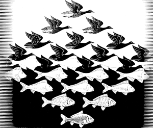
Edmund Tufte, the dean of visual communications, describes figure/ground relationships in this formula: 1 + 1 = 3. This means that we not only see 2 positive objects in a picture, but the negative space between them. This is exemplified by the tesselations of M.C. Escher.
A Simple Approach to Good Composition
1. The most natural and pleasing size ground upon which to compose a picture is a Golden Rectangle, or a rectangle whose dimensions are 1 unit by 1.62 units. Photographers and film makers can work close to this proportion in the aspect ratios of their medium (1 by 1.5), but software developers are stuck with 3 by 4.
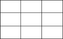
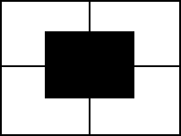
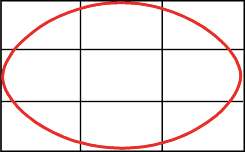
2. Divide the rectangle into thirds. This will aid in locating the “sweet spots” in which to place the center of interest. Don't divide the picture into 4 equal quarters. This is boring, and can lead to producing four pictures in one painting. Avoid placing the center of interest in the dead center of the support.
|
Do This:
|
Not This:
|
 |
 |
3. Lead the viewer’s eye around the composition by providing a path to follow. It could be an oval, or another shape such as a diamond or pentagon. The path should connect with the top, bottom, and sides of the picture, and should provide an entrance to and an exit from the picture. The entrance is most often at the bottom of the painting. The exit you provide is an area that is progressively less important. A door, window, or patch of sky can provide a place to “rest” the viewers' eye; a subtle exit. The path should, of course, lead to the center of interest. If the path begins to point out of the picture, adjust it accordingly, using whatever element you might come up with to lead the viewers' eye back to the path.
4. Simplify. Delete details that complicate your composition. Eliminate anything that doesn’t express your message simply and clearly. Subordinate, combine, and delete.
5. Attempt to bring positive and negative space into harmonious balance.
Screen "Real Estate": The Prominence Level of Various Screen Locations on Computer and Video Monitors
The 4-unit-wide by 3-unit-high aspect ratio of the screen resembles a two-page spread of a book or magazine, where each page is a 2-unit-wide by 3-unit-high rectangle. The prominence level of various screen coordinates relates to this model.
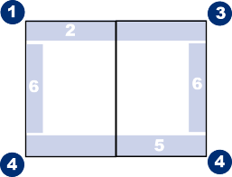
The prominence heirarchy then is:
Where the eye is drawn:
Visual prominence accrues to:
Simplicity and elegance are achieved by:
Avoid clutter and visual noise
|
Heading 1 |
|
|
Row Label 1 |
If you put things in data prisons, |
|
Row Label 2 |
they become hard to read |
|
Row Label 3 |
because the information fights with the boundaries |
References:
http://www.makart.com/resources/artclass/