 |
Visual
Analytics and Imaging Laboratory (VAI Lab) Computer Science Department, Stony Brook University, NY |
|
Visual
Analytics and Imaging Laboratory (VAI Lab) Computer Science Department, Stony Brook University, NY |
Abstract: Social vulnerability is the susceptibility of a community to be adversely impacted by natural hazards and public health emergencies, such as drought, earthquakes, flooding, virus outbreaks,and the like. Climate change is at the root of many recent natural hazards while the COVID-19 pandemic is still an active threat. Social vulnerability also refers to resilience, or the ability to recover from such adverse events. To gauge the many aspects of social vulnerability the US Center of Disease Control (CDC) has subdivided social vulnerabilities into distinct themes, such as socioeconomic status, household composition, and others. Knowing a community’s social vulnerabilities can help policymakers and responders to recognize risks to community health, prepare for possible hazards, or recover from disasters. In this paper we study social vulnerabilities on the US county level and present research that suggests that there are certain combinations, or patterns, of social vulnerability indicators into which US counties can be grouped. We then present an interactive dashboard that allows analysts to explore these patterns in various ways. We demonstrate our methodology using COVID-19 death rate as the hazard and show that the patterns we identified have high predictive capabilities of the pandemic’s local impact.
 |
This paper won the Best Paper Award at the 2022 Workshop on Visual Analytics in Healthcare (VAHC), jointly held with the 2022 Annual Symposium of the American Medical Informatics Association (AMIA) in Washington, DC. |
Teaser: The below shows the interface of our COVID-19 Risk Explorer:
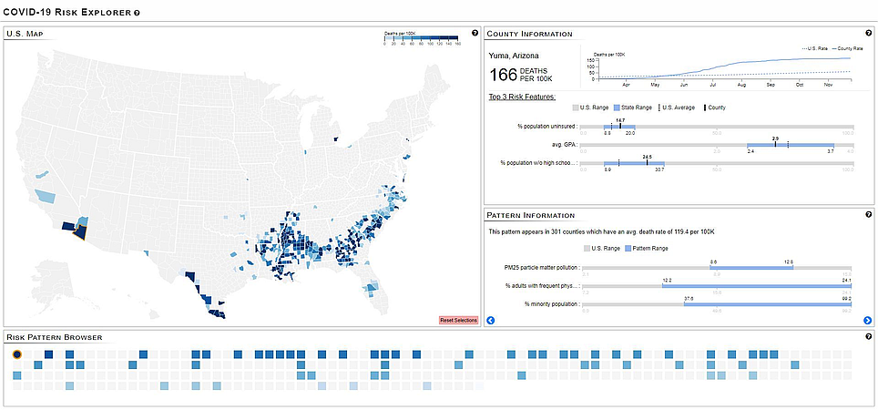
The COVID-19 Risk Explorer dashboard for exploring risk patterns that drive COVID-19 death rates in the US. On the the top left is an interactive geomap of the US counties shaded by their COVID-19 death rate. A county can be selected by clicking the mouse on its map location. Here, the user selected Yuma, AZ, marked by an orange outline. The bottom panel has the risk pattern browser which represents all the risk patterns as tiles, shaded by their COVID-19 death rate. Only the patterns relevant to the selected county (Yuma, AZ) are shaded. Users can select a risk pattern by clicking the mouse on a pattern tile. Here the user selected the first pattern, marked by an orange outline. All counties that share this pattern are then shaded on the map. The top right panel shows information about the selected county while the panel below it offers information about the selected pattern.
Video: Watch it to get a quick overview:
Paper: D. Coelho, N. Gupta, E. Papenhausen, K. Mueller, "Patterns of Social Vulnerability – An Interactive Dashboard to Explore Risks to Public Health on the US County Level," Workshop on Visual Analytics in Healthcare (VAHC, jointly held with the Annual Symposium of the American Medical Informatics Association (AMIA), Washington, DC, November, 2022. PDF | PPT