Much of our data has a temporal component, and a spatial component.
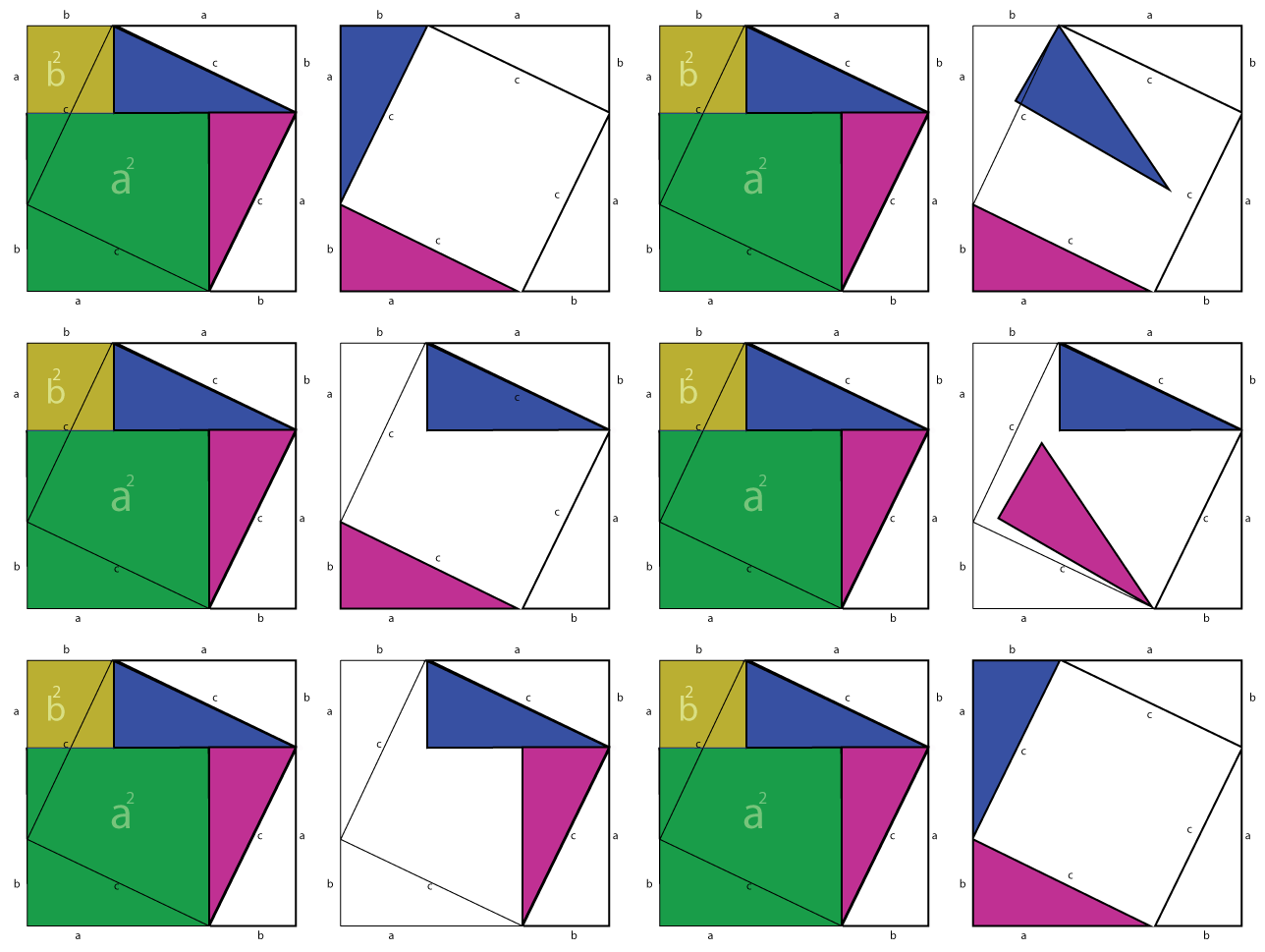
Changes over time can appear in a single image or in small multiples.

But somethimes animation is the best way to tell a story. This illustrates Euclid's proof of the Pythagorean theorem.

Hans Rosling: TED talk, Gapminder
Ocean temperatures, from NASA
Interactive history timelines for teachers and students
Circos is used for visualizing genome data