 The purpose is to communicate information through the presentation of words, numbers, and pictures.
The purpose is to communicate information through the presentation of words, numbers, and pictures.
Above all else, show the data. Make sure the ink on the page (or pixels on the screen) conveys as much information as possible.

Word cloud of President Obama's acceptance speech 2008
Gapminder Bubbles show data trends over time
Word cloud generator
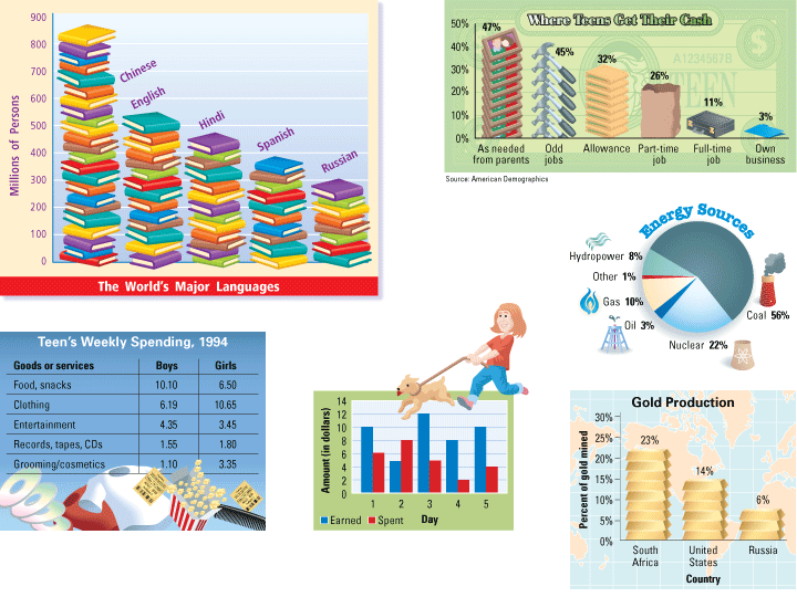
Data visualization approaches
Other visualization tools
Data ink can represent multiple values simultantously, by modifying the color, size, position, or saturation.
Color can be used to label, measure, represent or imitate reality, and enliven or decorate.
Saturated colors must be used sparingly, or they will cancel each other out.
Color is symbolic, arousing our emotions.
NASA has established guidelines for designing presentations with color
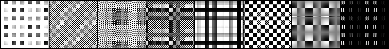
Chartjunk is ink that doesn't tell the viewer anything. At best, it is wasteful. At worst, it is distracting and confusing.
Chartjunk is often manifested as unintentional optical art (moire patterns), grids, and gratuitous graphics.
Common mistakes in data presentation
Even Steve Jobs is guilty of chartjunk sometimes
Op art pages show what happens if you look at this stuff too long