Visual
Analytics and Imaging Laboratory (VAI Lab) Computer Science Department, Stony Brook University, NY |
Visual
Analytics and Imaging Laboratory (VAI Lab) Computer Science Department, Stony Brook University, NY |
Purpose: Correlation is a statistical measure to gauge how strongly pairs of variables are related. Knowing correlations among variables allows one to make predictions and discover possible causal relationships. We have developed interactive software that analyzes the correlation among mutlivariate data and visualizes the result as a network graph. In addition to its intuitive visual interface, a novel contribution of our system is that it can handle both numerical and categorical variables in one common framework. Our method first transforms the categorical variables into continuous space using a numerical optimization scheme and then employs the standard Pearson's formula to compute the pairwise correlation coefficients. Among a number of other datasets we have also used our software to study the various factors associated with universities. We present the outcome of these studies here.
The data: Our dataset consists of 50 colleges and 14 attributes: academics, athletics, campus housing, night life, safety, transportation, weather, dining, PhD/faculty ratio, population, household income, USNews score, tuition, and location. The dataset is an amalgamation of data obtained from two different sources: the College Prowler website and US News & World Report. The former ranks each school across the 20 most relevant campus life attributes. We took the top 50 colleges from US News and three attributes USNews score, tuition, and location. All the other attributes are from College Prowler. In this dataset, location is a categorical variable in terms of city, the others are numerical ones.
The visualization: In our visualization, each variable is a node in a network graph. Larger nodes have more diversity. Nodes that are closer to one another are more tighly correlated. Edges between nodes are colored by the sign and strength of correlation. Bright green edges denote strong positive coreelation, while bright red edges denote strong negative correlation. Fainter colors mean that a correlation still exists but that it is weaker. The figure below shows the correlation network visualization for our college dataset.
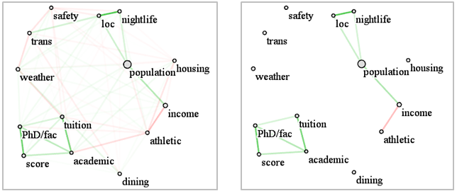
Observations:
The large size of the population node indicates that the dataset contains
a large variety of university settings -- urban, suburban, and rural -- and
so it is quite representative. From the network graph on the left we observe
that the majority of correlations are not overly strong, as is apparent from
the mildly saturated edges and nodes. So in order to isolate the more significant
correlations we raise the edge correlation threshold to a correlation factor
of 0.3 (1.0 is the maximum). The resulting map is shown on the right. We observe
two fairly independent clusters—one dealing with academic aspects, the
other with student life. This reveals that these two aspects of the college
experience tend to be largely independent in general. In the following more
detailed observations we shall refer to the figure on the right.
We observe that the correlations within either of these clusters are mostly
positive (indicated by the green edges). In the ‘academic’ cluster
at the bottom left all variables (US News Score, PhD/Faculty ratio, Tuition,
and Academics) are positively correlated with one another. Hence, when one
variable increases, all others will increase too, and vice versa. This observation
is consistent with our knowledge that highly ranked universities (high US
News Scores) usually have better academics and higher tuition. Yet, because
students are more willing to go there, the PhD/faculty ratio is higher.
On the other hand, in the ‘student life’ cluster on the right
we observe that athletics is negatively correlated with income, whereas income
is positively correlated with population. A possible explanation for this
is that the universities with good athletics are usually located in rural
areas, which are less densely populated, and the income in these areas is
relatively low compared to other more populated areas (e.g., New York City).
We also find that night life has a high positive correlation with location
and population, which is also justifiable.
Many more conclusions can be drawn from this single visualization, and so
we believe that these maps can be helpful for students to select universities,
as well as for university executives to make policies. Our software package
is freely available -- please contact us at the email given below.
Further information:
[1] Z. Zhang, K. McDonnell, K. Mueller, "A
Network-Based Interface for the Exploration of High-Dimensional Data Spaces,"
IEEE Pacific Vis, Songdo, Korea, pp. 17-24, March, 2012.
[2] Z. Zhang, X. Tong, K. McDonnell, A. Zelenyuk, D. Imre, K. Mueller. "An
Interactive Visual Analytics Framework for Multi-Field Data in a Geo-Spatial
Context" Tsinghua Science and Technology on Visualization and
Computer Graphics, 18(2), April, 2013.
[3] K. McDonnell and K. Mueller, "Illustrative
Parallel Coordinates," Computer Graphics Forum, 27(3):1031-1038,
2008.
Contact: mueller{remove_this}@cs.stonybrook.edu
Funding: Partial
support for this research was provided by NSF grants 1050477, 0959979, and
1117132. Further support was provided by the US Department of Energy (DOE)
Office of Basic Energy Sciences, Division of Chemical Sciences, Geosciences,
and Biosciences. Some of this research was performed in the Environmental
Molecular Sciences Laboratory, a national scientific user facility sponsored
by the DOE’s OBER at Pacific Northwest National Laboratory (PNNL). PNNL
is operated by the US DOE by Battelle Memorial Institute under contract No.
DE-AC06-76RL0. Parts of this research was also supported by an LDRD grant
at Brookhaven National Lab.